The challenge
The 2 biggest challenges with this project were 1) a 2 week turnaround for research, wireframe, design, iterations, and development... including client approvals, and 2) creating an end product that was both graceful, stylish, and forward thinking.
When creating "one pagers" (simply a single page website that uses only one HTML page), the main focus is on the user's journey and overall end goal for the both users and the business.
Role
My role in this project was to make sure that the user was informed about the Lodge at Edgewood Tahoe and had an avenue to get in touch.

UX Challenges
Creating a modern and elegant landing page that uses trendy animations but remains easy to use.
UX Goals
My goal was to convey to elegance of the Edgewood Tahoe property onto a digital platform.
UX Approach
Using UI and UX design trends, but in a modern and graceful way.
Research
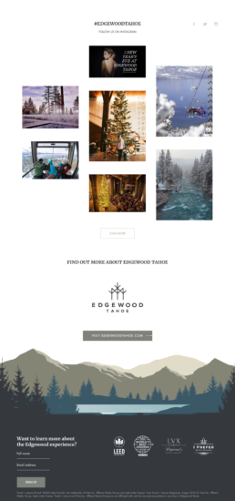
My main areas of focus for research and discovery was to check out their current website for look and feel, and see what trends were for interaction and animation design. Interaction design was tricky for this website because I wanted to set it apart with interactions, but I didn't want to make it feel gimmicky. A happy compromise was adding a forest skyline in the footer along with parallax and depth to the scene as the user scrolls.
A few UX trends that I follow when creating one pagers are:
The size of forms matter – I wanted to ensure that I kept it clean, precise, and to the point.
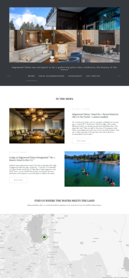
For the newsletter form, I only ask for a full name and email address. The client did ask to ask for more information here, but after talking with them, the information that would have been gained with the forms, they still ask via email or phone. Since that was the case, a name and email address is sufficient and will increase the conversion rate for users filling out forms.
Insert some compelling factors, such as the CTA with attractive benefits.
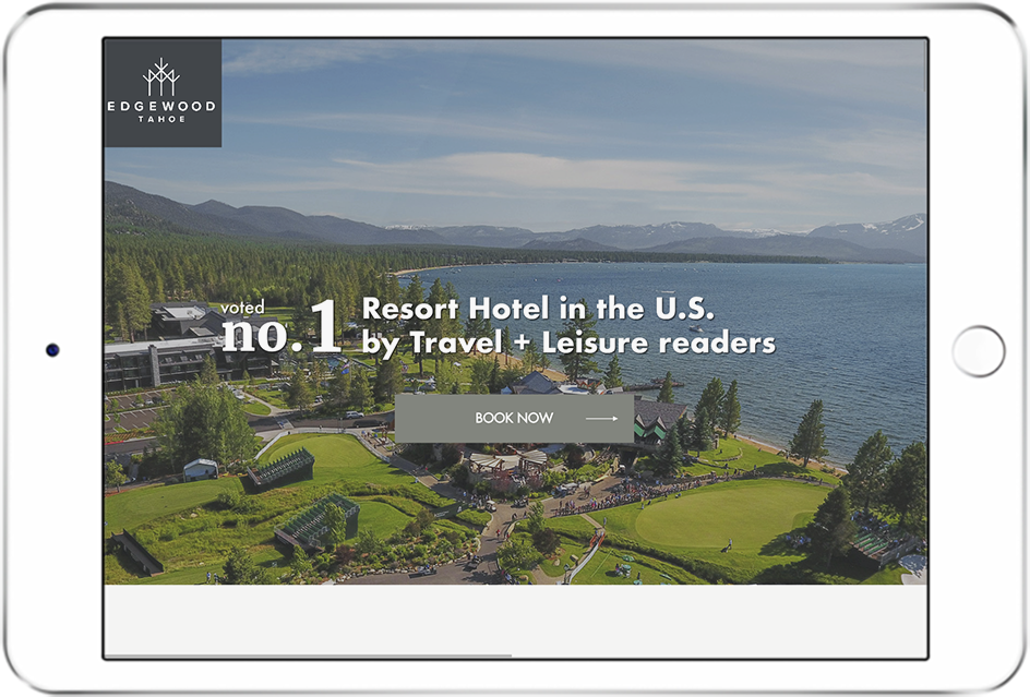
The CTAs (call to actions) that I have are “Book Now” and “Sign Up”. Since this site is talking about the Lodge at Edgewood Tahoe, these are the 2 main things that the target users are going to want to do when navigating the site.
The content should be compelling and impressive, persuading the user to take the desired action.
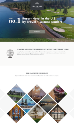
Edgewood Tahoe is beautiful, elegant, and caters to travelers that enjoy the finer things in life. This site needed to get that feel across in both the look and wording.
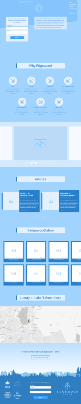
Wireframe
I created this wireframe so that the client has an idea of how the landing page was going to look and flow.
Great for clients to approve and iterate upon before developing
Used for prototyping in InVision
Used as a guide to the UI Designer
Used as a guide for the front end developers
Wireframe
I created this wireframe so that the client has an idea of how the landing page was going to look and flow.
Great for clients to approve and iterate upon before developing
Used for prototyping in InVision
Used as a guide to the UI Designer
Used as a guide for the front end developers
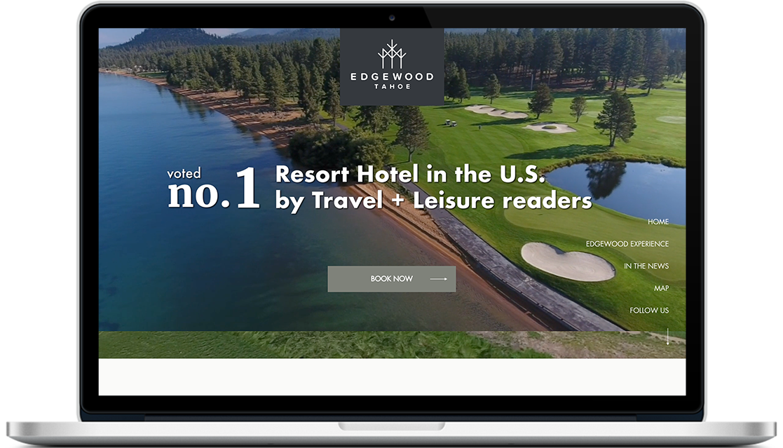
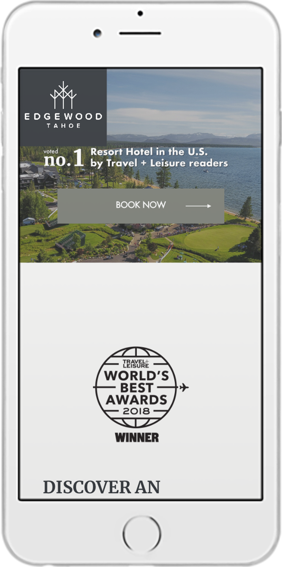
The solution
01. Web
02. Mobile
03. Tablet